|
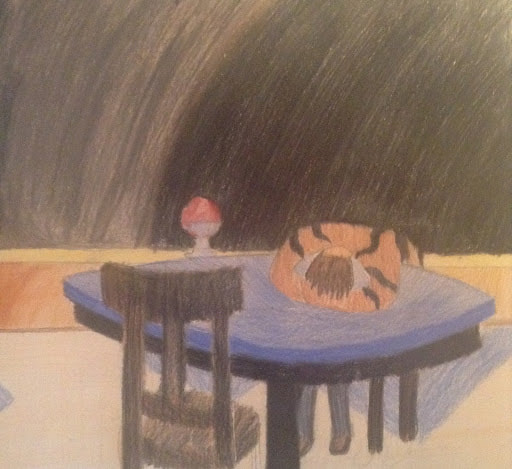
Title: A Hazy Grasp Size: 25.5 x 38 cm Medium: Colored Pencil on Illustration Board Date: November 30th, 2020 This piece was meant to represent the vague grasp that a single person may have. Similar to a disconnection with people, people may become disconnected with some of the events happening on the outside world, being hindered by themselves. |
Artist Inspiration
|
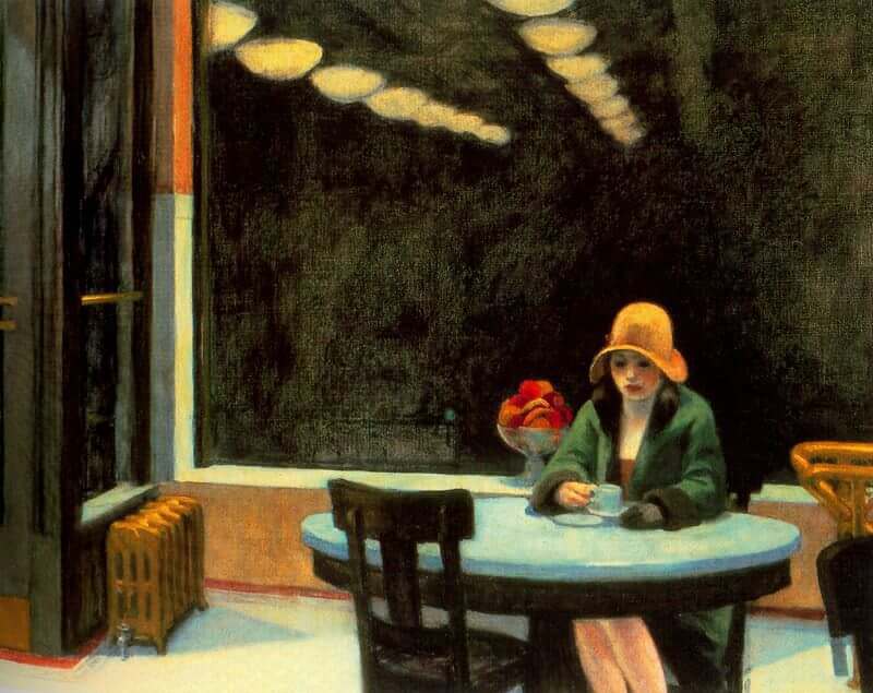
My artist inspiration for this project was Edward Howard. I chose this artist not necessarily because the artwork is negative. In fact, there's not a very strong reason to assume the work is positive or negative; it seems relatively neutral. I chose this artist due to the strong use of blending in the piece, as well as the setting. I felt like the setting could be used to make a depressing scene. |
|
Planning
|
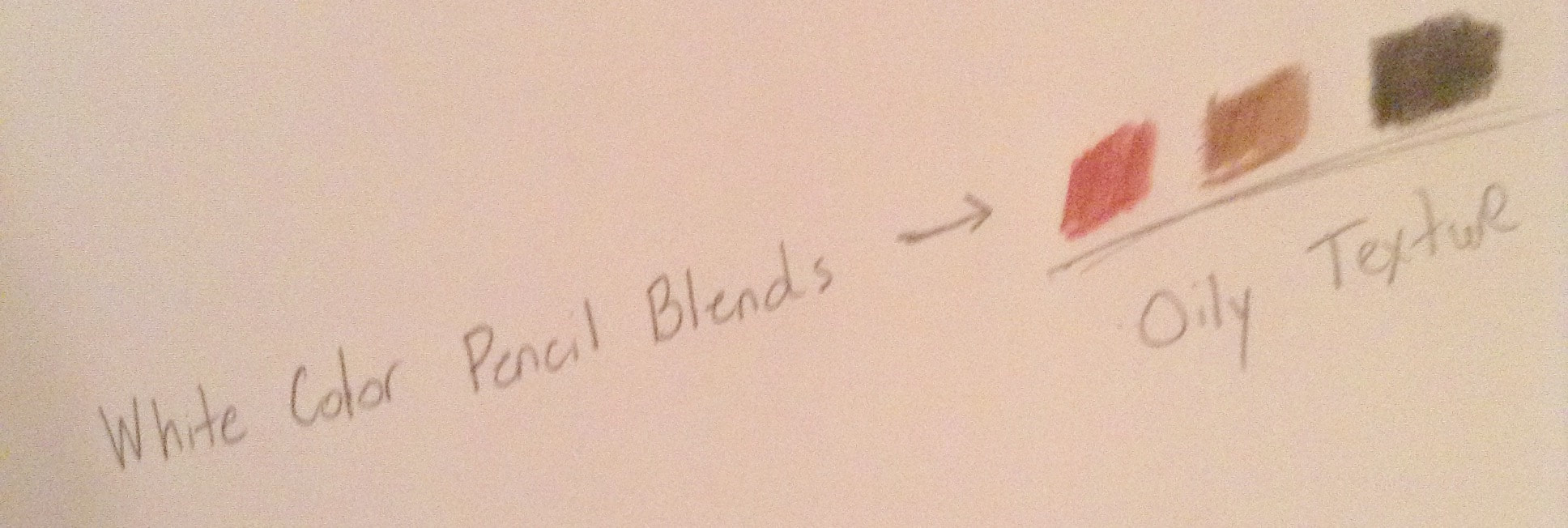
For the blending, I found that strong impressions with the white color pencil on another color generate an oily blend. This blend could prove useful for creating a blurry area should I desire it, likely for the background. |
|
In terms of blending colors together, I also have to remind myself to progressively use darker shades, as well as use darker shades with the multiple colors I am using in order to maintain the overall consistency of what I am illustrating. |

|

|
As for the scene in general, I wanted it to be a slightly zoomed in area of the piece from my artist inspiration, to keep the focus on the person primarily. With this perspective, key parts such as the flowers, table, chair, and the darker area of the background can be included and incorporated into the theme I intend |
Process and Experimentation
To start the project, I began with a light pencil sketch that would outline the objects in the picture. In terms of illustration, some of these pencil sketches would have to be erased before coming into contact with color pencil, otherwise the sketch would stick out more than the lighter colors I used. I also began the background, being a mix of brown, grey, and black. I left some white space around the person and the flowers in case I decided to change their appearance slightly.

I then continued to color portions of the table and the chair, using varying colors. The chair was a blend of varying levels of black, and a consistent tone of brown. Brown had to be layered multiple times in some areas to maintain consistency. The table was primarily varying levels of blue, with a black bottom. I also finished the background and surrounded the flowers and the person with them. I also layered the background with white color pencil, to produce the blurry, oily texture for the background. This did, however, have a downside where the lighter part of the background stood out.

For the last portion of this assessment, I colored in the hair of the man, and developed a part of the floor. Looking back at the floor, I wish the colors were stronger, and especially darker around the underside of the table. I also used some white color pencil blends in order to mix them together more; ironically leaving less white space. I did however include some extra gray and brown into the background, so it sticks out a little less. I also added a few more layers of color, primarily to the man, to make remove more white space and look a little more like an individual rather than a fusion to the table.

Compare and Contrast

Compare
- Similar setting that orients around a single character. Does not necessarily pertain to a positive illustration - Varying dark colors included for the background - Background contains 2 significantly different colored portions |

Contrast
- Edward's work had a noticeable yellow tint that is exempt from this assessment - The background blends together well and also includes the yellow tint - This artwork is meant to be negative in nature; Edward's work seems to be neutral in nature. - A smaller adaptation in many ways, primarily the scene, characters, and some objects are smaller than presented in the original. |
Reflection
Overall, I am rather disappointed with the result of this project, as it was a far different product than what I intended it to be. The use of blending in this project is only significantly present on the chair, and the background performs this at a lesser extent. Also the floor happened to be the most neglected part of the work, as the yellow floor barely stood out, and the blue portion of the floor seemed to stand out too much. Also the anatomy of the person was relatively inaccurate, and seemed more like a mass rather than a human body in terms of flexibility. The positioning of the chair and feet, while not completely inaccurate, could be improved. If I were to redo this project, I would include more of the yellow tint present in the inspiration, and include more time on the table, floor, and person.
ACT Questions
1) Clearly explain and describe how you are able to identify the cause-effect relationships between your inspiration and its effect upon your artwork.
The inspiration I chose caused me to make most of the scene that I would use. I would take it's neutral nature and convert it into a parody that would turn it negative in nature. He posed a scene that wasn't necessarily harmful unless the person considered it to be.
2) What is the overall approach (point of view) the author (from your research) has regarding the topic of your inspiration?
The artist overall made a painting that was neutral in nature. It didn't necessarily possess qualities that would register it as a positive or negative illustration. It posed a sense of tranquility rather than art that has a more chaotic or interactive scenery.
3) What kind of generalizations and conclusions have you discovered about people, ideas, cultures, etc. while you
researched your inspiration?
When I initially started this project, I was under that all art would fall under one of the categories "positive" or "negative" even if it was presented subtly. My inspiration was a prime example of the "neutral" category that could actually be represented as positive or negative depending on the viewer.
4) What was the central idea or theme around your inspirational research?
When doing this project, I wanted a negative nature that oriented around disconnection or limitations. The "shadows" surround the person and limits their view of the area and served as like a representation of how their mental state could even "limit their actions".
5) What kind of inferences (conclusions reached on the basis of evidence and reasoning) did you make while reading your research?
I made the inference that neutral art didn't necessarily mean that it couldn't be positive or negative, but that it depends on how the viewer feels about the work. For example, the solitude of the woman could be seen as a negative disconnection from people, or the tranquility of the scene could be considered a positive view of peace.
Bibliography
Automat, 1927 by Edward Hopper, www.edwardhopper.net/automat.jsp. - (Source of Image)
