

|
Title: Progressive Vistage
Size: 25x12 cm Medium: Paint on carved wax template Date of Completion: 8- 18 - 21 (?) For this piece, I wanted to present how our standards have developed compared to our history. Similar to cave paintings, art has developed yet still retains similarities. |
|
Artist Inspiration
My artist inspiration for this piece is Thom Quine. His artworks often revolve around replicating the style found in old cave paintings. I wanted to replicate this style in order to connect with my theme. An old style would serve as a reference to a comparison between the past and the future. An old style being used to show the past and traces of that style being shown in our modern world. |

|
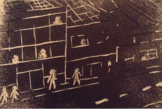
Planning Sketches
|
I started by taking the wax plate and making a crude sketch along it. Since this was supposed to replicate an old style of painting, the appearance would be legible but also relatively basic. It could be considered similar to a cave painting, but it would more accurately represent a carving on an old tree. While not nearly as prominent as cave paintings at the time, carvings were also an active part of art in the past. Since this would not necessarily be a high detail project, the sketch itself was also basic. Pencil lines would likely have been covered by the black paint used later.
|

|

|
The same process was used for this print. Though with the amount of lines present in this sketch, I had to be ready to differentiate the things present in the picture. Unlike the first one where I was ready to carve the interior of the picture I had decided I would try to carve along the lines of this picture, so you could be able to separate one thing from another, rather than a building just being 1 massive block with a carved rooftop.
|
Process and Experimentation
|
For these prints I had primarily focused on carving the interior of the sketch that I had made. After that, I added extra carvings along the left side of the painting, where part of a tree is present. This would generate texture as well as a minor level of movement to the piece. I would later try a similar method to the grass, but in the form of thin cuts that would be present when painted. A similar approach was used on the sky area, but with thicker and a lower amount of carvings in order to represent the stars and separate the sky from the grass. I had also carved miniature representations of people who would be watching from the hills, representing people as a group working together.
|

|

|

|
For this print, like I had stated before, I had carved the interior of the people out, and then moved onto shaping the buildings. I carved along the lines drawn in the sketch in order to shape the buildings and their features. When painted over this would provide a crude but understandable representation of the difference between the past and modernity. The progression between two times represented in an old style similar to cave paintings (or rather, wood carvings). I found it relatively difficult to draw the buildings at accurate angles, let alone attempting to carve out some of the patterns I had placed. This would later come to affect me when the time came to paint over the block prints.
|
The carving itself definitely proved itself to be a challenge. I was at least aware that I had to keep mistakes to a minimum, as I did not have many chances to work with. If I had managed to carve too deep, or made additions that I regret later, holes would be left that I would not be able to correct. Because of this, I had attempted to be as precise as possible with the outlines that I had left, as to not make many possible areas. I started by carving the edges of my outlines, so that I could freely carve the interior out without fear of carving outside of the intended area. This worked mostly successfully, as I did have a couple errors, but nothing major or too frequent. I found it difficult to add texture within the smaller shapes however, resulting in me leaving them relatively smooth and lacking detail.
When the time came to paint over the block prints, the process began to go downhill. In the first place, I had no proper tool to roll over the prints with paint. In an attempt to mimic what I would need, I tried to take a strategy that was used once in my freshman year. I took a glass cup and I wrapped it around as tightly as possible in paper towels. With that, I would be able to roll into the block prints. This actually failed spectacularly, as the paper towels managed to spread paint into the crevices where the standard tool would avoid painting. This resulted in one of the prints receiving significant damage, and the other one would not be able to be painted over in this manner. I had required an extra plate in order to create a new plate entirely. Upon working with the new tool, it was much more effective, but some areas (primarily on the 2nd template) were still covered with paint due to me applying too much pressure. Because of this, I would have to carve out the areas that had been filled incorrectly with ink before I could start over.
After buying the proper tool and removing the excessive ink, I had started to roll over. The result was far better for the first print, though it still managed to paint over the carvings I had placed in order to represent the texture of the grass. The sky however, as well as the shapes of the people had remained mostly fine, though were also missing bits of texture that I had placed there as well. The second had still struggled to keep paint from entering the crevices, as the carvings I had made were not deep enough. Due to that the patterns as well as the shape of the buildings, even some of the people that had been carved were painted over in ink. The errors in the second print would affect the presentation of the print itself, but the actual paper prints off of this carving would still prove to be effective. As for printing these out on paper, this proved to be a significant challenge, as I believe the ink I was using was too thick for what I was using. The ink wouldn't cover everything in the paper, leaving consistent and glaring blank areas in the paper prints. Since I had no other ink to work with, I had to leave the paper prints as they were.

|

|
Reflection
If I had to repeat this project, I would definitely have to take another approach, primarily in how I prepare for this project. Had I found the proper tool to paint over the block print, the accident could have been avoided. The process of actually carving the print went as intended, but there were some difficulties. Primarily when carving smaller targets, I tend to have either extremely deep cuts in the wax that stood out, or long cuts that went over the outline of the sketch. If these had been painted over they would have left a large impression on the silhouettes that could have made them look like something other than a person. The matter of preparing for painting would definitely have to be done properly, with no room for substitute suggestions. Had I not attempted to work with an ineffective method and resources, the projects could be painted over without issue.
Compare and Contrast

|

|
|
Compare
- both works attempt to resemble an old style of art. (Though these are comparing paintings to a carving)
- both artworks have considerable focus on the "life" in the picture. Quine's work focuses on the bison, while my work focuses on the silhouette of people.
- both have a unique texture for different reasons. Quine's work was done on paper similar to a scroll, while my work was carved onto a wax plate.
Contrast
- The artworks are generally different mediums. My work is a carving, while Quine's work is a painting. This can make it difficult to compare in some ways.
- Quine's work has a lot more emphasis on color, being a painting. A block print cannot be that precise with its work.
- Quine's work is more alike a standard cave painting or carving style for that matter. Backgrounds are not often included in carvings or paintings like what is present in my work.
-
ACT Questions
1) Clearly explain and describe how you are able to identify the cause-effect relationships between your inspiration and its effect upon your artwork.
Since my theme wanted to connect the past to modernity, my inspiration's style was crucial to having important value included into my piece. A replication of an old style depicting an old setting and a modern setting would be a powerful asset to be in this project.
2) What is the overall approach (point of view) the author (from your research) has regarding the topic of your inspiration?
Thom Quine had a unique approach to his artwork. Replications of cave paintings are not extremely common (it actually took a bit to find artwork with a specific artist listed). The way he attempts to do this is also unique, as even details like texture and hue from the background of the paper is also taken into account.
3) What kind of generalizations and conclusions have you discovered about people, ideas, cultures, etc. while you researched your inspiration?
Since the theme of this project revolved around connections between the past and modernity, I had to make some generalizations of what someone from the past would try to represent modernity as. I made a generalization that cave paintings often told stories or was used to represent mythology, but a project representing modern society would not often take that into account.
4) What was the central idea or theme around your inspirational research?
The theme around my research was often about the progression of humanity from the past to modern time. I would attempt to make this connection using a crude style similar to cave paintings using Thom Quine as my inspiration.
5) What kind of inferences (conclusions reached on the basis of evidence and reasoning) did you make while reading your research?
When reviewing my research, I made conclusions that in the purest sense, art in the past was primarily about recalling stories, regardless of accuracy. Modern art today progressed on from that in a way. While modern art can still present stories, they can also present themes, morals, things that came along naturally as time passed. This notion also connects to my theme of progression, and how society has moved on since then.
Bibliography
Anna, et al. “Tag: Art History.” Ancient Earth Pigments, 27 May 2020, www.ancientearthpigments.com/tag/art-history/. - Source of Image
